Lessons in Engraver’s Script
By WA Baird
*The accompanying text for each lesson can
be found at the bottom of this page.
Lessons in Engrosser's
script by WA Baird
(from
the Business Educator)
*PLEASE REASD: The text for lessons 6, 7, 8 and 10 can be
viewed on the image links above. I have NOT text converted them so they are NOT
listed below.
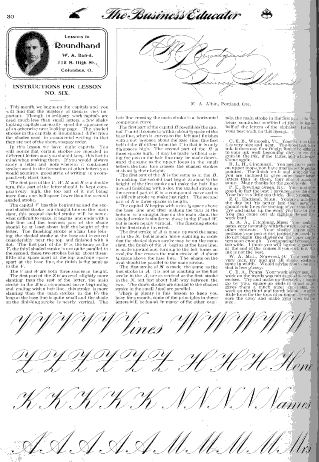
Instructions for lesson 1
By way of apology for this course in Roundhand or Engrossing
Script, little need be said of this style of penmanship itself. While it is an
old style, it seems to be quite popular at the present time, and its popularity
seems to be increasing.
To execute it to a fair degree of accuracy, you must first
have a clear idea of the forms to be made, but outside of the shaded down
strokes there is not such a great difference between the forms used in
Roundhand and those used in Light-line writing, as at first seems apparent.
This style is strictly ornamental, and like most ornamental
arts, is slow in execution.
Materials.
There is no paper, pen or ink made, that I consider too good
for Roundhand. Most cheap papers will soak up ink like a blotter when any
shading is attempted, and since Roundhand is a shaded hand, such paper is
entirely unfit for this work. There are a number of good grades of paper on the
market, but for a high-grade paper, cut to a convenient size I would recommend
the "seventeen and one half pound Wedding" paper, handled by Zaner
& Bloser.
I use "Zanerian" India ink; it is more convenient
than and gives as good results as stick
Use an oblique holder, specially adjusted for Roundhand; the
10-cent holders handled by Zaner & Bloser are as good as any, and they will
adjust them if instructed to do so. For these lessons use a Zanerian Fine
Writer or a Gillott's No. I pen
Position and Movement.
Use the same position at the table as in light-line writing,
both as regards the arm and the paper. Owing, to the comparatively slow speed,
the pen must be field somewhat tighter than for business writing. The hand may
lie turned farther to the right and may rest on the side; the little finger
being the center of control.
The movement comes principally from the forearm and the
wrist, giving the wrist a sort of rocking motion; the fingers are not used as
much as might be expected. I would advise each one to lose no opportunity to
watch some one write Roundhand, as you could then see the movement employed,
and the work would be easier.
In the first exercise in the copy, try for uniformity in
width of stroke and spacing between lines. Place your pen on the paper and
press down on it until the points are forced open as wide as you desire the
stroke to be, then move the pen downward and make the stroke; starting in this
way will make the tops square.
The lower-turn exercise will naturally start the same as the
straight line, and should hold the same width until the pen has traveled
between two thirds and three fourths of the distance to the base line, when it
should begin to taper in order to make the turn. See that the right side of the
stroke is nearly straight, and that the taper comes from the left side. Raise
the pen as you come to the base line and replace it to make the
hairline-connecting stroke. Always raise the pen at the base line, and you will
find it equally as helpful to raise it at the top of all minimum letters. Take
particular notice where the hairline apparently joins the shaded stroke. In
making the upper-turn the introductory stroke should begin slightly below the
base line; the upper-turn will naturally be the reverse of the lower turn. The
hard part will be to keep the strokes from getting wedge-shaped, too wide at
the square end of the stroke, and too narrow near the turn. In the exercise
giving the double-turn, try to make the upper and lower-turns equally round.
The rest of the lesson is composed of these principals joined together. Strive
for uniformity in width of line, in spacing and in slant. Nearly every stroke
used in making minimum letters is given in this lesson. Work hard and study the
copy carefully.
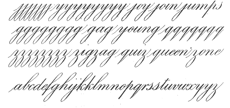
Instructions for lesson 2
We have in this lesson the remaining strokes used in the
minimum letters. I have given you a half line on the double turn the same as in
the first lesson in order that you may have a chance to redeem yourselves for
the mistakes you may make in your first attempt. Try to get both the top and
the bottom turn equally round, and the shade heaviest at half the height. A
good test for this exercise is to turn the paper up side down and see if your
work looks equally well in that position. If it does not
start in to remedy it.
The e, c, o and a contain the same
principle and when one is mastered the others will come easy. The beginning
stroke should be gracefully curved and made with a free movement, the shaded
stroke should be made much slower, it is curved but
not circular. Notice that the heaviest part of the shade is below half the
height of the letter. In the 'e' the second shaded stroke is made downward the
shade being near the top. The hook on the c is made downward and the dot should
not be shaded too heavily. The first shaded stroke of the o is the same as that
in the e and c. The second shade is made after the letter has been completed.
The 'a' is similar to the 'o' so far as the oval part is concerned. It is
finished same as the letter 'i'.
The letter x will be somewhat difficult,
the heaviest part of the shade should be above half the height of the letter.
The down stroke in the second part of the x is slightly curved. The main stroke
of the x if turned upside down will make a good letter c.
The letter 'a' will perhaps give you more trouble than the
others. The up stroke should be more slanting than the up stroke in the other
letters, this will make it easier to get the shaded stroke on the same slant as
the other shaded strokes, the dot or blind loop at the top of the s should be
somewhat higher than the other minimum letter. See that the dot at the bottom
of the s does not cross the first stroke.
In writing the word see to the spacing, try to keep the down
strokes equally distant. Good spacing will cover up more faults than any other
one factor. This lesson will conclude the large work. It was given in order
that your faults would be more readily noticed than in small work. Work hard on
this and the first lesson as the minimum letters are used much oftener than the
extended letters or the capitals. Send in your best efforts on this work and
you will not regret in the end the time spent in learning this style of script.
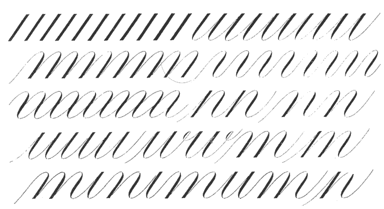
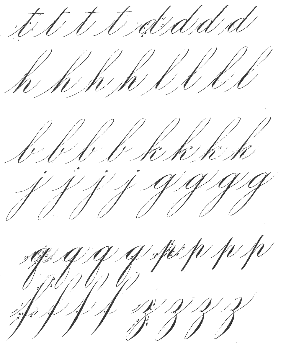
Instructions for lesson 3
The exercise on the first line of this lesson is one that should
be mastered before beginning work on the letters themselves. You will find it
extremely hard to keep the down strokes of equal heft,
there will be a tendency to swell the shade when you have completed about one
half of the stroke. This will be due to the fact that the stroke is much longer
than in the minimum letters and you have to exceed your range of motion. You
will soon overcome this difficulty however if you practice on the first line of
the lesson and stick to it. Do not try the letters or words until you feel
reasonably sure of the first line. Another tendency will be to taper the shade
too much as you near the base line. After You have made a line of this exercise
place your ruler over the upper half of the work and see if the lower part would
resemble your best effort on an exercise of the small letter u. It ought to.
Be sure that you have your paper ruled and make the exercise
two spaces high. The connecting hairline should extend up one space. The letter
t, given in the second line is a repetition of the first line with the crossing
added. The crossing is made 1/3 of a space from the tot). The letter d consists
of the oval used in the 'a' and is merely an 'a' with the second shaded stroke
extended another space higher. See to it that both shaded strokes are of equal
width. The letter p is three spaces high being 1 1/2 spaces
above the base line and 1 1/2 spaces below. The second shaded stroke of p is
the same as the last stroke in the m and n. Retouch the strokes that are finished off square at either
one, or both ends just as soon as you make them. It will soon become a habit to
do this, and will in time be done almost unconsciously. The letter h in this
style is 2 1/2 spaces high, the second shaded stroke
is the same as that in the letter p.
The first part of the k is the same as in the h, the second
part however is entirely different, it consists of a hair line stroke
commencing one space to the right of the first stroke and joining the first
stroke 1-2 space above the base line, it should be a compound curve and can be
made upward instead of downward if preferred. The second part of the finishing
stroke begins at the junction of the two other strokes and is a compound curve,
the general direction of which is nearly vertical. The joining of the two parts
of the finish for the k forms a small loop. The letter 'l' is the same as the
first line exercise only 1-2 space higher. The letter 'b' is the same as I
except the finishing stroke which is the same as the finish for the v and w.
This lesson will be good training in slant as the long shaded strokes are what
determines the slant of page writing, that is, more so than the minimum strokes
do.
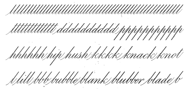
Instructions for lesson 4
In this lesson we have the upper loop letters and you will no
doubt find that the loop is quite difficult. There are two ways of making the
loop, 1st, make it the same as you would make it in ordinary business writing
by making the right side of the loop upward and going over the top make the
heavier side downward. 2nd, after making the introductory stroke, which at the
beginning of a word should begin a little below the base line, raise the pen
and begin at the top of the loop and make the heavier side of the loop first,
and after reaching the base line raise the pen again and beginning again at the
top of the letter make the right side of the loop. In this way both sides of
the loop are made downward and I believe that the average person will learn to
make good loops in much less time than in the first way described. This is only
my belief and it may have been formed on account of having learned that way
myself, as the best writer of Engraver's Script that I know of makes the loops
as first described. If this is your first attempt at Roundhand it would perhaps
be a good idea to practice them both ways arid by all means
adopt the way by which you can do the best work.
In following the work rule lines for the tops of the loops
which in this lesson are three spaces in height as compared with two and one
half spaces the height given the extended letters In the 3rd lesson, but while
the letter Itself is longer by actual measurement in the loop style, it would
not appear so on account of the shade tapering at the top while in lesson No. 3
the shade of the extended letters was as great at the top as at any other
point.
You will notice that in beginning the loop the pen at first
travels just about as much to the left as it does in a downward direction.
Notice also that after the beginning of the shade the stroke is straight. This
feature is quite noticeable in the f, hand k. The shape of the loop itself is a
very important feature and a fault which seems to be a general one is to have a
saggy looking loop, which is caused by keeping the loop the same width almost
its entire length. Another fault is to drag the shade on the right side of the
loop too far. This shade which should be very slight and kept as close to the
top as possible adds greatly to the life of the
letter, but if carried down too far, detracts from it.
The loop is the feature of this lesson, the finishing
strokes of the h, k, I and b are the same as given in lesson three. In this
lesson however, I have given you two different finishes for the b, one is the
loop and the other a blind loop or a loop that is afterward filled in. We also
have an additional letter the f. The f is always made with a loop,
the letter extends three spaces above the base line and one space below it.
Notice the dot on the base line to the left of the stem, it should be made
large enough to avoid looking weak, but not large enough to attract more
attention than the rest of the letter. Do not practice on the loops to the
exclusion of the minimum letters, but try and build them all up together. This
is a hard lesson so work hard to master it.
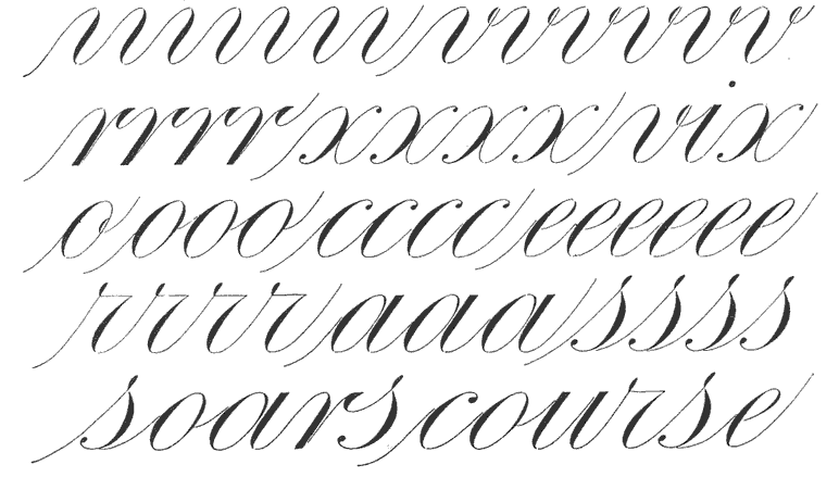
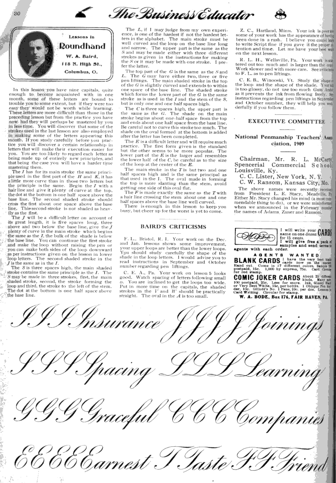
Instructions for lesson 5
This month we have the loops below the line, which completes
the work on the small letters. This lesson will undoubtedly be harder than the
previous lessons in many ways and will call for harder work on your part.
The lower loop is just the reverse of the upper loop, the
main stroke of the loop is practically straight on the inside as far as the
shade extends which is about 2 and a half spaces. Write your work the same size
as the copy and rule head and base lines for the minimum letters and also for
the loops, be careful about pen liftings, all liftings are plainly shown in the copy and you should study
the copy carefully.
The lower loop like the upper loop call he made in two ways:
first, make both sides of the loop downward, the heavy side first and second,
by making the loop with but one stroke. I would recommend the first way to
beginners, but after one has become quite proficient I believe better looking
work can be turned out by the second method.
The j is composed of a preliminary stroke and the loop with
a dot above it be sure the dot is on a line with the loop and do not make it
too large; the first stroke of the y is a double turn same as finishing stroke
of n. The g is composed of an oval same as the o or a with
the loop added, see to it that there is a small space between the hair line of
the oval and the shaded stroke of the loop. The q is the same as the g as far
as it goes, it extends only 1 1/2 spaces below the base line the same as the
letter p, while all the other loops extend two spaces below the base line, the
finishing stroke of the q is a slightly curved stroke to the right of the main
stroke of the loop. The q is spoken of here as a loop but in reality it is not,
at least in this style. The z will be found to differ some from the other
loops, the first part of the x is the same as the first stroke of the n. In
beginning the loop the pen swings to the right and then downward, be careful to
keep the shade on this loop rather high as there is a tendency to drag it too
far down, more so than in the other loops. Study very carefully the spacing in
the words, especially for letters which follow the o.
In the lower line of the copy we have the entire small alphabet, this will afford all excellent opportunity to see
how often certain strokes are repeated. I have not given many different styles
of letters, but have tried to give those which seem to me to be the most common
in use. All the upper loop letters with the exception of the f call be made
with a straight stroke the same as the second k, the g and j may be finished
the same as the y, but when this finish is used it rarely extends more than one
space below the base line.
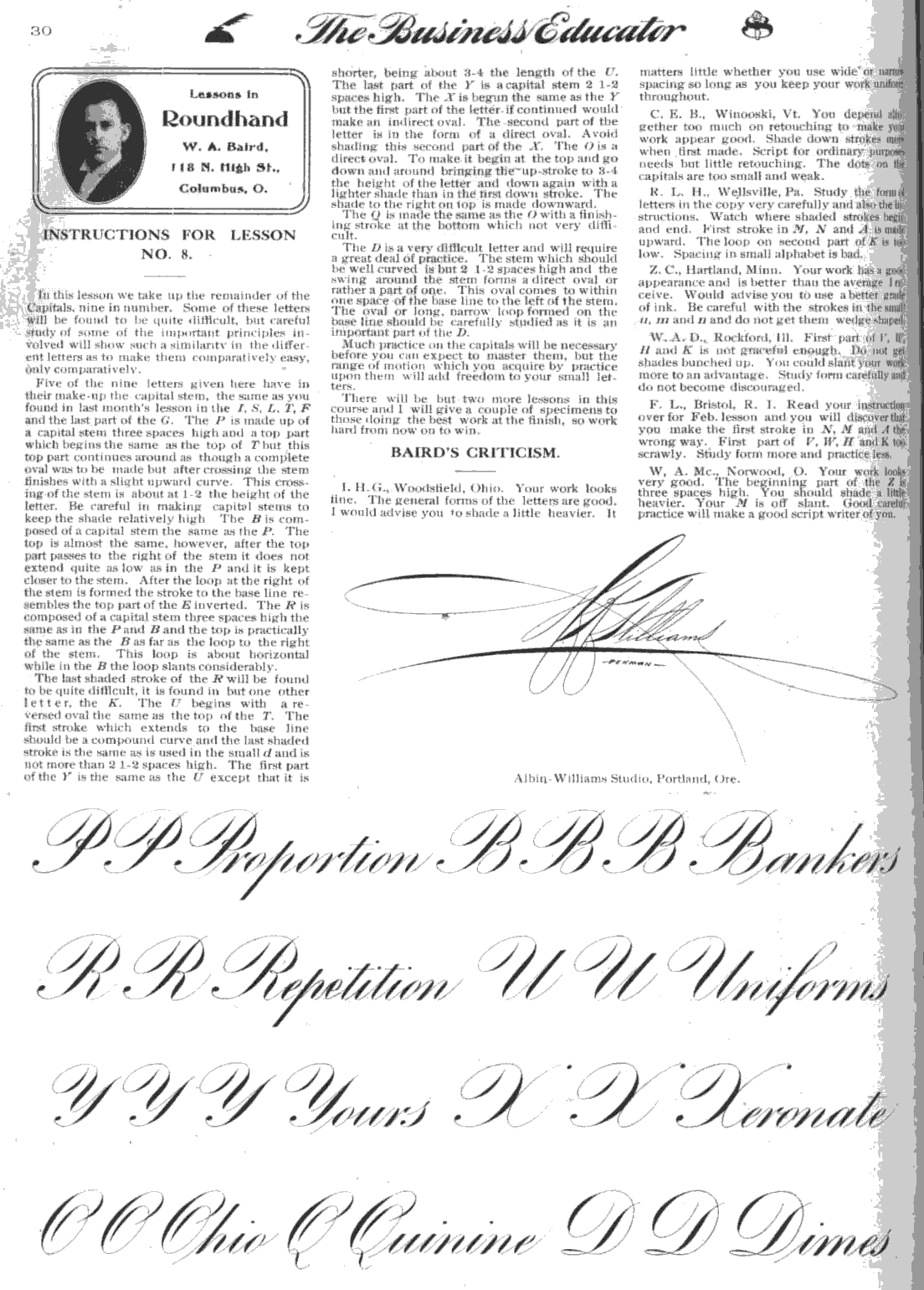
Instructions for lesson 5-8 and 10
(*See corresponding image links above)
Instructions for lesson 9
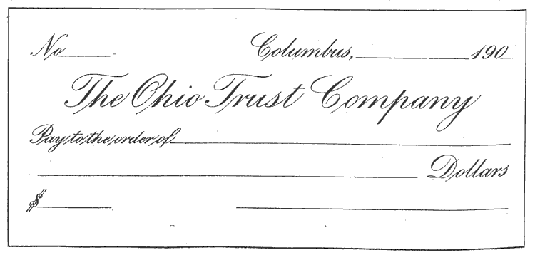
This month we have an example of Engraver's Script applied
to a commercial Paper. You will also notice that the greater part of the work
is smaller than you have had up to this time.
Arrangement and neatness in your work will be a factor this
month more than ever, and I expect to see evidence of greater interest on your
part, as the work should now begin to be a pleasure and not a task, because you
will have something to look at besides a monotonous humdrum of letters when
this lesson is finished
Write your work the same size as the copy, ruling both head
and base lines to govern the height of minimum letters. The wording should be
sketched with a lead pencil in order to get the proper arrangement. Watch the
spacing between words as well as in them. Do not get the spacing narrow in one
word and wide in the next, shifting the paper so as to keep the pen the same
distance from the eye at all times will be found of great benefit as regarding
spacing and slant also. Watch the slant carefully, as there is a tendency to
write more slanting as the size of the work decreases.
Careful study of the forms of letters is of course of the
greatest importance, but arrangement and neatness are also very important and
they require no additional skill. They a merely a matter of
carefulness and forethought. It might be a good idea for you to look
over the instructions given all through this course and examine your work
carefully to see if you are following them.